Fix: keep Submit-to popover at a constant height when the recipient list collapses - #99260
Fix: keep Submit-to popover at a constant height when the recipient list collapses#99260MelvinBot wants to merge 3 commits into
Conversation


Collapse the three coupled height declarations (innerContainerStyle minHeight,
wrapper getHeight, content getMinimumHeight) into one fixed height owned by
innerContainerStyle in useReportSubmitToPopover, so the recipient list scrolls
inside a constant-size popover instead of resizing it when the list collapses
to the empty state. Landscape height path is left untouched.

Co-authored-by: Kevin Brian Bader <ikevin127@users.noreply.github.com>

 melvin-bot
Bot
added
Melvin-Test-Android
Melvin-Test-Web
melvin-bot
Bot
added
Melvin-Test-Android
Melvin-Test-Web

|
I created this PR from an upstream branch since you don't have a fork of To take ownership of this branch and be able to push updates, run: Then you can close this PR and open a new one from your fork. |
Co-authored-by: Kevin Brian Bader <ikevin127@users.noreply.github.com>
|
Fixed the failing Oxfmt check by running The only real failure was formatting: The other red check, |
|
The Oxfmt check is now green — the formatting fix I pushed earlier (f3fc55d) resolved it. No further code changes are needed. The only remaining red check is |

Codecov Report❌ Looks like you've decreased code coverage for some files. Please write tests to increase, or at least maintain, the existing level of code coverage. See our documentation here for how to interpret this table.
|
✅ Android test results — PR #99260Ran the testing steps on Android (standalone NewDot, branch Verified:
Caveat — one sub-case not directly exercised: the test workspace has only a single member, so I couldn't produce a long, scrolling recipient list to directly observe the "Confirm button not clipped while the list is scrolling with many rows" case. The single-row populated state matched the empty state exactly, and the code fix routes overflow through a scrollable No JS console errors were observed. EvidenceSubmit to popover populated with recipient list (Melvin Bot)Submit to popover collapsed to 'No results found' empty state after non-matching search |


✅ Web test results — PR #99260Ran the testing steps on Web (dev NewDot, branch Verified:
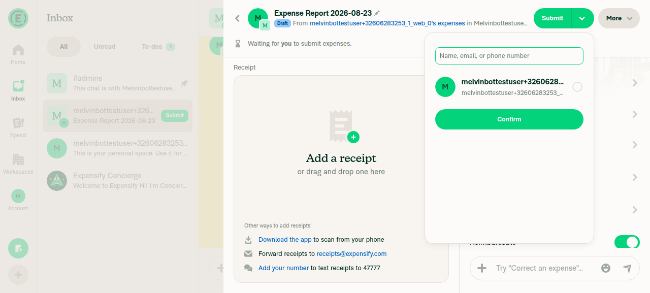
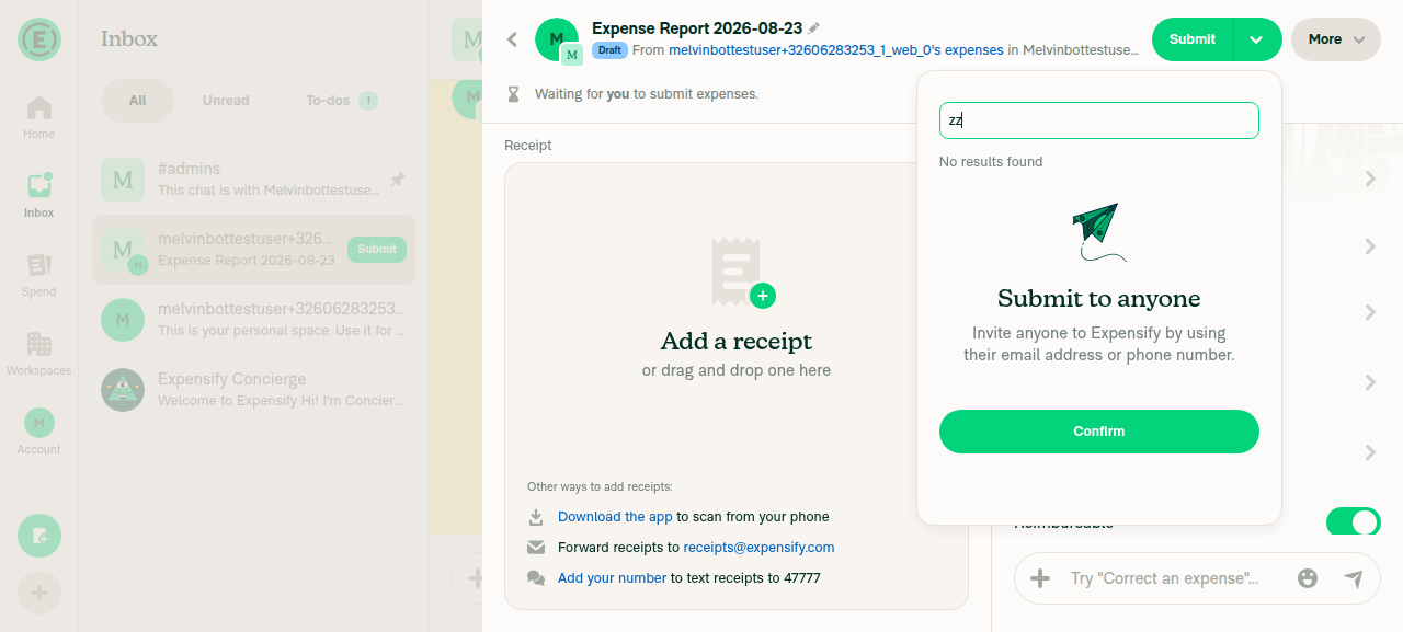
No JS console errors were observed. EvidenceSubmit-to popover with the recipient list populated (1 workspace member)Submit-to popover collapsed to the 'No results found' / 'Submit to anyone' empty state, same overall height as the populated state |

| @@ -230,10 +230,14 @@ function useReportSubmitToPopover({reportID, onSubmitSuccess, anchorAlignment = | |||
| [StyleUtils, isSmallScreenWidth, popoverContainerStyle, viewportOffsetTop, windowHeight], | |||
| ); | |||
|
|
|||

There was a problem hiding this comment.
🟠 Portrait narrow with the keyboard open is missing from the test matrix
The matrix covers "landscape with and without the keyboard" but not portrait narrow with the keyboard open. That is the most common mobile interaction in this flow: tap the search input, the keyboard opens.
It matters more now than before. The bottom-docked modal on small screens gets {height: 416} from innerContainerStyle (with popoverContainerStyle contributing only styles.w100), so it is a hard 416 where it previously had a minHeight floor it could adapt around. The popover sets avoidKeyboard and the small-screen path applies StyleUtils.getOuterModalStyle(windowHeight, viewportOffsetTop), so a fixed 416 plus a keyboard shift on a short device is a plausible clip or off-screen top.
Note also that confirmButtonOptions.showButton is !keyboardActiveHeight || !isInLandscapeMode, so in portrait the Confirm button stays visible with the keyboard open. That is the combination to test: portrait narrow, keyboard open, button still visible and not clipped.
There was a problem hiding this comment.
Added to the test matrix. The suggested matrix in the PR description now lists portrait narrow with the keyboard open (search input focused) as its own orientation, with the note that in portrait confirmButtonOptions.showButton keeps the Confirm button visible so it must not be clipped on short devices.
Note the mechanism you described has shifted with the applied fix: innerContainerStyle no longer sets {height: 416} in portrait — the height now lives on the wrapper View (useReportSubmitToPopover.tsx:277), while the small-screen avoidKeyboard + getOuterModalStyle path is unchanged — so this combination is still worth an explicit check.
| // Drop the extra top padding on the narrow bottom-docked mobile modal so the search input sits | ||
| // closer to the top; the wide/desktop popover keeps `pt4`. | ||
| style={[StyleUtils.getHeight(submitToPopoverContentHeight), styles.flexColumn, !isInLandscapeMode && styles.flex1, styles.w100, !isSmallScreenWidth && styles.pt4]} |
There was a problem hiding this comment.
🟡 The wide popover gets 16px shorter, which is a behaviour change beyond "constant height"
Before, pt4 was additive on the wide path, so the wide portrait popover rendered taller than 416. Now the whole thing is 416 with pt4 inside, dropping the usable content area to 400.
The height being constant is what was asked for. The height also shrinking is a side effect that nobody signed off on, and it costs 16px of list space on the surface Shawn is actively reviewing.
Please call it out explicitly in the PR description and get a quick confirmation, rather than letting it arrive as a surprise in the next design pass. If he wants the previous size preserved, the fixed height should be 432 on the wide path rather than 416.
There was a problem hiding this comment.
Called out explicitly in the PR description. Added a behaviour note flagging @Expensify/design / shawnborton for a quick sign-off: with the corrected approach the wide portrait popover is now a constant 416px with pt4 (16px) inside it (≈400px usable), versus the ~432px it rendered at before when pt4 was additive. I kept the code at the DIFF you specified (416) rather than pre-emptively bumping to 432 — if Shawn wants the previous size preserved, the wide-path fixed height can be set to 432 and I can push that.
| // here is what lets the recipient list scroll inside a constant-size popover instead of resizing the popover when | ||
| // the list collapses to the empty / "No results found" state. `FixedFooter` already pads 20px below the Confirm | ||
| // button, so no extra bottom padding is added here. | ||
| const containerStyle = useMemo(() => [styles.w100, styles.flex1, styles.pt3], [styles.flex1, styles.pt3, styles.w100]); |
There was a problem hiding this comment.
🟢 containerStyle no longer needs useMemo
The branching is gone, so this is a static array literal. CLAUDE.md states "Do not use useMemo, useCallback, or React.memo in components or hooks that compile with React Compiler", and the compliance check passes for this file, so the compiler memoizes it anyway. Since this line is already being rewritten, simplify:
const containerStyle = [styles.w100, styles.flex1, styles.pt3];There was a problem hiding this comment.
Done — containerStyle is now a static array literal (ReportSubmitToContent.tsx:466):
const containerStyle = [styles.w100, styles.flex1, styles.pt3];The React Compiler compliance check still passes for the file, so it's memoized anyway.
|
The Oxfmt failure was already fixed in my earlier push (f3fc55d) and is now green. The two remaining red checks aren't fixable by a code push:
No code changes are needed here. |

|
@MelvinBot the current approach in this PR doesn't work. I reproduced both failure modes on web desktop: with four recipients, pressing Confirm so the error appears pushes the Confirm button past the bottom edge and clips it, and on the "No results found" state the button rides up under the paragraph instead of staying pinned. The cause is that The fix is to invert which layer owns the height. The wrapper I verified this locally on web desktop, mWeb and native: with a multi-recipient list the list becomes scrollable and the scroll surface grows when the error appears, the button stays pinned on the empty state, and the popover height is constant between the two states. Please push exactly this. Keep your DIFF- // This is the single owner of the popover height in portrait. Using a fixed `height` (not `minHeight`) keeps the
- // popover a constant size whether the recipient list is full or collapsed to the empty state, so searching a
- // non-matching string no longer shrinks it. The content below fills this height via `flex1` and the list scrolls
- // inside it. `pt4` (wide only) is applied to the inner wrapper as padding within this height, not added on top.
+ // No height in portrait: the wrapper `View` below owns it. This container is the modal's own box, so a height set
+ // here does not bound the content (the wrapper's `flex1` had nothing to resolve against, which let the content
+ // overflow the fixed box and pushed the Confirm button out of view).
const innerContainerStyle = useMemo(
() => ({
...popoverContainerStyle,
- ...(isInLandscapeMode ? styles.getPopoverMaxHeight(windowHeight, true) : {height: popoverDimensions.minHeight}),
+ ...(isInLandscapeMode ? styles.getPopoverMaxHeight(windowHeight, true) : {}),
}),
[popoverContainerStyle, isInLandscapeMode, windowHeight, styles],
);
@@
<View
collapsable={false}
- // In portrait the height is owned by `innerContainerStyle` above, so the wrapper just fills it with
- // `flex1`; only landscape still needs an explicit measured height. Dropping the extra top padding on
- // the narrow bottom-docked mobile modal keeps the search input close to the top; the wide/desktop
- // popover keeps `pt4` (as padding within the fixed height, not added on top of it).
- style={[isInLandscapeMode ? StyleUtils.getHeight(submitToPopoverContentHeight) : styles.flex1, styles.flexColumn, styles.w100, !isSmallScreenWidth && styles.pt4]}
+ // Single owner of the popover height: this is the `flexColumn` box that directly parents the
+ // content, so the height here is what bounds the chain below and lets the list scroll instead of
+ // growing the popover. `flex1` is deliberately omitted, since `flex-basis: 0` would override the
+ // height and hand sizing back to the content. `pt4` (wide only) is padding within that height.
+ style={[StyleUtils.getHeight(submitToPopoverContentHeight), styles.flexColumn, styles.w100, !isSmallScreenWidth && styles.pt4]}
>
@@
styles.flexColumn,
- styles.flex1,
styles.w100,
styles.pt4,
isSmallScreenWidth,
- isInLandscapeMode,
submitToContentKey,Two notes on the dependency array: Also, I lean toward the second, since deleting it silently couples this popover's height to the generic dropdown max. Once you applied the DIFF that's fixing the current issue - also address my 3 code-review comments from above since they are still standing even after the fix is applied. |
The wrapper View (the flexColumn box that directly parents the content) now
owns the portrait height via getHeight; innerContainerStyle (the modal's own
box) no longer sets a height there. flex1 is dropped from the wrapper so
flex-basis:0 can't override the height. Wires the dedicated
POPOVER_REPORT_SUBMIT_TO_CONTENT_HEIGHT into the portrait branch of
submitToPopoverContentHeight, and drops the now-static useMemo on
containerStyle.

Co-authored-by: Kevin Brian Bader <ikevin127@users.noreply.github.com>
|
No new code fix needed — the only real failure (the Oxfmt check) was already resolved by the formatting commit f3fc55d, and all substantive checks (typecheck, tests, ESLint, React Compiler, perf, etc.) are now green. The one remaining red check, |
|
Pushed your DIFF and addressed all three review comments in Applied exactly as specified ( Dead-constant note — took your preferred option 2: rather than deleting Review comments:
Static checks (all green):
|
|
The
No code changes needed here — nothing left for me to fix. |
|
@Expensify/design You can run an adhoc build on this PR to verify how it looks on wide / narrow layouts - let me know if it looks as expected. I'll have this open for review and post my review checklist videos on monday. |

|
🚧 dubielzyk-expensify has triggered a test Expensify/App build. You can view the workflow run here. |
|
🧪🧪 Use the links below to test this adhoc build on Android, iOS, and Web. Happy testing! 🧪🧪
|


2 participants


Explanation of Change
Follow-up to #98939.
shawnbortonflagged that the Submit to popover changes height when the recipient list collapses to the empty / "No results found" state, so searching a non-matching string visibly shrinks it. This was intentionally left out of #98939 because a naive fix broke the layout (seeikevin127's breakdown); only the padding fix shipped there. This is not a regression from that PR — the same jump reproduces onmain.Root cause: the portrait popover declared its height across coupled layers, so no single layer owned it and the popover grew with content instead of scrolling. A first attempt to make
innerContainerStyle(the modal's own container) the fixed-height owner did not work: a height set there does not bound the content — the wrapper'sflex1had nothing to resolve against, the content kept sizing to itself and overflowed the fixed box, clipping the Confirm button (with a full list, pressing Confirm to surface the error) or letting it ride up under the paragraph (on the empty state).The fix inverts which layer owns the height, so the recipient list scrolls inside a constant-size popover:
View— theflexColumnbox that directly parents the content — is now the single owner of the portrait height (StyleUtils.getHeight(...)).flex1is deliberately dropped from it, sinceflex-basis: 0would override the explicit height and hand sizing back to the content.pt4(wide only) is padding within that height.innerContainerStyleno longer sets a portrait height (landscape still uses the measuredgetPopoverMaxHeight).ReportSubmitToContent.tsxkeepscontainerStyleatflex1(the oldgetMinimumHeightfloor stays removed) so the content fills whatever height the popover gives it and the list scrolls.CONST.POPOVER_REPORT_SUBMIT_TO_CONTENT_HEIGHT(viasubmitToPopoverContentHeight), keeping the intent explicit rather than silently coupling to the generic dropdown max.The landscape height path (
calculateModalHeightInLandscapeMode→getPopoverMaxHeight, and the keyboard-hidden Confirm button) is deliberately left untouched.Verification status (please read — human cross-platform pass still required)
Done by Melvin (static):
npm run typecheck-tsgo— passednpm run lint-changed— passednpm run react-compiler-compliance-check check(both changed files) — passednpm run spell-changed— passednpm test -- tests/ui/ReportSubmitToContentTest.tsx— 4 passed (existing regression tests still green)NOT verified — needs the human co-author. This is a layout-sensitive change and browser/device verification could not be completed in this run. Because the whole point is cross-orientation layout, please verify visually before marking ready. In particular confirm the two failure modes do not occur: (a) the Confirm button is not clipped off the bottom with a full/scrolling recipient list (surface the error by pressing Confirm with nothing selected), and (b) on the empty state the Confirm button still sits pinned at the bottom (not floating up under the paragraph).
Suggested matrix (from
ikevin127's breakdown):pt4), portrait narrow with the keyboard open (search input focused — in portraitconfirmButtonOptions.showButtonkeeps the Confirm button visible, so verify it is not clipped on short devices), landscape with and without the keyboard.SubmitPrimaryAction,SubmitActionButton,MoneyReportHeaderSecondaryActions,SelectionToolbar, and the four Search list rows (ReportListItemHeader,TransactionListItem,ExpenseReportListItem,ExpenseReportListItemRowWide).Fixed Issues
$ #98637
PROPOSAL:
Tests
// TODO: The human co-author must fill out the tests they ran before marking this PR as "ready for review" (see the "Verification status" section above for the suggested matrix — orientation × list size × populated/empty state × host surface).
Offline tests
N/A — layout-only change.
QA Steps
// TODO: The human co-author must fill out the QA tests before marking this PR as "ready for review".
PR Author Checklist
### Fixed Issuessection aboveTestssectionOffline stepssectionQA stepssectionAvatar, I verified the components usingAvatarare working as expected)StyleUtils.getBackgroundAndBorderStyle(theme.componentBG))npm run compress-svg)Avataris modified, I verified thatAvataris working as expected in all cases)Designlabel and/or tagged@Expensify/designso the design team can review the changes.mainbranch was merged into this PR after a review, I tested again and verified the outcome was still expected according to theTeststeps.Screenshots/Videos
Android: Native
Android: mWeb Chrome
iOS: Native
iOS: mWeb Safari
MacOS: Chrome / Safari