Fix edit composer height to match the main composer - #99193
Conversation


Co-authored-by: Shawn Borton <shawnborton@users.noreply.github.com>

 melvin-bot
Bot
added
Melvin-Test-Android
Melvin-Test-Web
melvin-bot
Bot
added
Melvin-Test-Android
Melvin-Test-Web

Codecov Report✅ Changes either increased or maintained existing code coverage, great job!
|

✅ Android test passedRan the testing steps on standalone Android NewDot. The edit composer now renders the same height as the main composer — no visible extra tallness in edit mode. Steps performed:
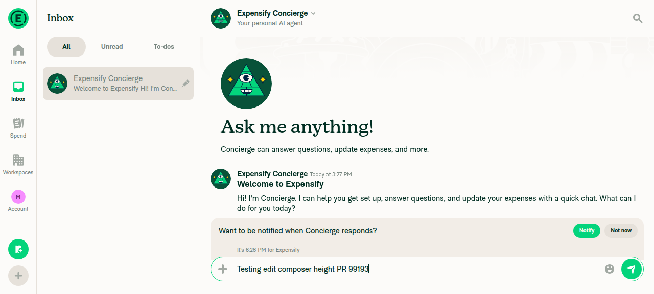
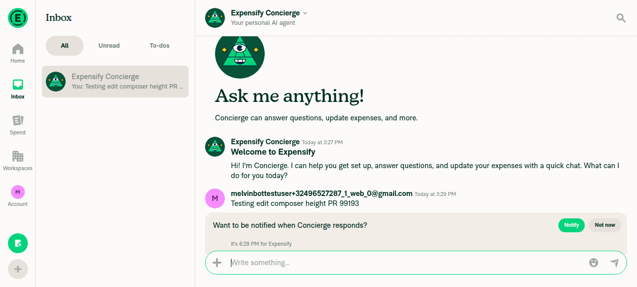
Verification (pixel-level, not eyeballed): Sampling the composer's green border column at screen center in both screenshots, the pill's top border sat at y≈2146–2148 and bottom border at y≈2269–2271 in both images — a pixel-identical bounding box (~125px tall) in the same absolute position. No height discrepancy, and no JS console errors. EvidenceMain composer at rest after sending a single-line messageEdit composer opened via long-press > Edit comment, showing same height as main composer |



|
🚧 shawnborton has triggered a test Expensify/App build. You can view the workflow run here. |
|
|
🧪🧪 Use the links below to test this adhoc build on Android, iOS, and Web. Happy testing! 🧪🧪
|


|
Testing well on my end: @MelvinBot please mark the PR as ready for review, fill out PR author checklist as best you can and add screenshots |


|
@Eskalifer1 Please copy/paste the Reviewer Checklist from here into a new comment on this PR and complete it. If you have the K2 extension, you can simply click: [this button] |
|
Done,
A few checklist items I left unchecked because they need a human or weren't covered:
Note: I couldn't automate the edit composer interaction on web (the web driver has no hover / Up-arrow primitive), so the web edit-composer evidence relies on your screenshot rather than an automated capture. The Android path was fully automated and pixel-verified. |
![chatgpt-codex-connector[bot]](https://avatars.githubusercontent.com/in/1144995?s=60&v=4)

There was a problem hiding this comment.
💡 Codex Review
Here are some automated review suggestions for this pull request.
Reviewed commit: 8003cfdd65
ℹ️ About Codex in GitHub
Codex has been enabled to automatically review pull requests in this repo. Reviews are triggered when you
- Open a pull request for review
- Mark a draft as ready
- Comment "@codex review".
If Codex has suggestions, it will comment; otherwise it will react with 👍.
When you sign up for Codex through ChatGPT, Codex can also answer questions or update the PR, like "@codex address that feedback".
| // button within the compose box (minHeight componentSizeMedium) instead of adding vertical margin. | ||
| // The extra marginVertical left zero slack once composerSizeButton grew to 40px, which let the edit | ||
| // compose box round up past the main composer's height. See https://github.com/Expensify/App/issues/99143 | ||
| const closeButtonStyles = [styles.composerSizeButton]; |
There was a problem hiding this comment.

When editing an inline message, the button's wrapper uses justifyContent: 'flex-end' (ReportActionItemMessageEdit.tsx:419), so composerSizeButton.alignSelf only centers the button horizontally within that column and does not center it vertically. Removing the 3px vertical margins leaves the 40px button against the bottom of the 46px content area, placing it 3px below the main composer's action button; preserve equivalent inner spacing without contributing to the compose box's outer height.
Useful? React with 👍 / 👎.

There was a problem hiding this comment.
Yep, we should choose another approach


There was a problem hiding this comment.
@MelvinBot can you please review this feedback?
There was a problem hiding this comment.
The feedback is correct — this needs a different approach. Removing marginVertical fixes the height, but it drops the cancel (X) button to the bottom of the compose box so it's no longer vertically centered (~3px low), which is what Eskalifer1's screenshot shows.
Why alignSelf doesn't save us here: the cancel button is wrapped in <View style={styles.justifyContentEnd}>. A React Native View defaults to flexDirection: 'column', so on that wrapper justifyContent: 'flex-end' controls the vertical (main) axis and pins the button to the bottom. composerSizeButton's alignSelf: 'center' (styles/index.ts:2558) only affects the horizontal (cross) axis in a column — it never vertically centers. So the code comment I added at MessageEditCancelButton.tsx:33-36 is mistaken on that point. The old marginVertical: 3 was exactly what produced the 3px bottom gap that made the button look centered.
Recommended fix: keep the height win (button footprint drops from 46px → 40px, restoring slack), but move the 3px of vertical spacing off the button and onto the wrapper, where it won't feed the compose box's intrinsic min-height:
- Add
paddingBottom: 3(i.e.composerSizeButton.marginHorizontal) to the cancel wrapper while keepingjustifyContent: 'flex-end'. The wrapper is already height-stretched by the row (alignItems: stretch), so padding doesn't grow the box — its intrinsic content becomes 40 + 3 = 43px, still comfortably under the 46px content area. This restores the 3px gap (centered at single line) and keeps the button bottom-pinned for multiline, consistent with the Submit button'salignSelfEndwrapper.
That preserves the height fix from #99143 without the vertical-centering regression.
For the record: my earlier Android pass verified the compose box height was pixel-identical, but it didn't measure the X button's position within the box — which is why this slipped through.
Want me to implement the paddingBottom change? Reply @MelvinBot implement the paddingBottom fix and I'll push it to this branch.
There was a problem hiding this comment.
@Eskalifer1 can you advise how you would like Melvin to fix this one?
There was a problem hiding this comment.
Done — pushed the paddingBottom fix in 359ca54.
What changed:
- Added a dedicated wrapper style
messageEditCancelButtonWrapper(justifyContent: 'flex-end'+paddingBottom: 3) and applied it to the cancel button wrapper atReportActionItemMessageEdit.tsx:419. - The button keeps its
marginVerticalremoved (height fix intact), and the 3px now lives on the wrapper as padding. Since the wrapper is height-stretched by the row, padding doesn't grow the compose box — intrinsic content is 40 + 3 = 43px, still under the 46px content area — so it restores the 3px gap that centers the X on a single line and stays bottom-pinned for multiline. - Also corrected the now-inaccurate code comment in
MessageEditCancelButton.tsx(it wrongly claimedalignSelfhandled vertical centering).
Checks: ESLint (0 new errors), typecheck (no src errors), oxfmt, and unused-styles all pass. React Compiler introduces no new errors — the pristine base fails with the identical 6 pre-existing ref-access errors, so my change adds none. The Jest suite couldn't bootstrap in this environment (a jest/setup.ts module-resolution failure that hits every test), and the web runtime check was blocked by a stuck/blank browser session — both infra issues, not related to this CSS change.
A reviewer should still eyeball the edit composer on web to confirm the X button now sits centered.
There was a problem hiding this comment.
Hi @shawnborton i will take a look at Monday, maybe i will find better fix, since i think this approach is more like a workaround
|
The two failing checks aren't code issues — they're process gates that only a human reviewer can clear, so there's nothing for me to push a fix for. Every code, build, lint, type, and test check is passing. ✅
Next step: get a reviewer to complete the checklist and approve — both checks will flip green on their own. No branch changes needed. |
|
Same situation as before — the only two failing checks aren't code issues, so there's still nothing to push a fix for. All code, build, lint, type, and test checks are green. ✅
Next step: these clear only through review — a reviewer needs to complete the checklist and approve. Re-running me won't change anything since there's no code fix involved. |
|
Still the same two — and neither is something I can push a fix for. All code, build, lint, type, and test checks are green. ✅
These are human-review gates, not code failures. Get a reviewer to complete the checklist and approve, and both will turn green on their own — no branch changes needed. |
|
Same as my earlier comment — nothing has changed, and there's still no code fix to push. The only two failing checks are human process gates:
Every code, build, lint, type, and test check is passing. ✅ These two will go green once a reviewer completes the checklist and approves — re-running me won't move them. |
|
Nothing to fix here — the only two failing checks are human-review gates, and every code, build, lint, type, and test check is passing. ✅
There's no branch change I can push to clear these. Next step: get a reviewer to complete the checklist and approve — both checks flip green on their own. |
|
Still the same two checks, and they're unchanged since my previous comment — both are human-only process gates, not code-fixable, so there's nothing for me to push:
Every code, build, lint, type, and test check is passing. ✅ The only way to turn these two green is a reviewer completing the checklist and approving — no branch changes will move them. |
|
Same result as before — there's no code fix to push. The only two failing checks are process gates that require a human, and every code, build, lint, type, and test check is passing. ✅
Next step: have a reviewer complete the checklist and approve — both checks flip green automatically. Nothing needs to change on the branch. |
|
Re-checked — same result as before. The only two failing checks are process gates that a human reviewer has to clear, not anything I can fix by pushing code. Every code, build, lint, type, and test check is green. ✅
Next step: have a reviewer complete the checklist and approve — both checks flip green on their own. There's no branch change to push. |
Co-authored-by: Shawn Borton <shawnborton@users.noreply.github.com>

|
The only failing check now is There's nothing for me to push here — the check will flip green on its own once the PR gets an independent approval. No branch changes needed. |
|
Still the same two checks, and neither is code-fixable — there's nothing for me to push. All code, build, lint, type, and test checks are passing. ✅
Next step: these are human review gates. Once a reviewer completes the checklist and gives an independent approval, both flip green on their own. No branch changes needed from me. |
|
Same situation as before — the only two failing checks are process gates, not anything I can fix by pushing code. Every code, build, lint, type, and test check is passing. ✅
There's no code fix to push here — these clear only when a human reviewer completes the checklist and approves. Once that happens, both flip green on their own. |
|
Still nothing code-fixable here — the only two failing checks are human-review gates, and every code, build, lint, type, and test check is passing. ✅
Neither is resolved by pushing to the branch, so there's no fix for me to commit. Once a reviewer completes the checklist and approves, both will turn green on their own. |
3 participants


Explanation of Change
Deploy blocker: the message edit composer renders slightly taller than the main composer (introduced in 9.4.58, staging-only).
Root cause: PR #98781 grew the shared
composerSizeButtonfrom 32×32 to 40×40. The edit composer's cancel (X) button — unlike the main composer's+button, which is absolutely positioned and contributes no height — sits in normal flow and additionally addsmarginVertical: composerSizeButton.marginHorizontal(3px). Its vertical footprint therefore became40 + 3 + 3 = 46px, which exactly equals the compose box's content area (minHeightcomponentSizeMedium= 48, minus the 2px border). With zero slack, sub-pixel rounding pushes the edit compose box just past 48px, while the main composer stays pinned at 48px. At the old 32px size there was 8px of slack, so production is unaffected.Fix: drop the extra
marginVerticalon the cancel button so its footprint (40px) sits well inside the 46px content area.composerSizeButtonalready hasalignSelf: 'center', so the button stays vertically centered, andminHeight: 48still floors the box — so the edit composer can't become shorter than the main composer either. This is the minimal change that removes the asymmetry the offending PR introduced.Fixed Issues
$ #99143
PROPOSAL:
Tests
Offline tests
N/A — this is a purely presentational (layout/sizing) change with no network dependency.
QA Steps
Same as tests.
PR Author Checklist
### Fixed Issuessection aboveTestssectionOffline stepssectionQA stepssectionAvatar, I verified the components usingAvatarare working as expected)StyleUtils.getBackgroundAndBorderStyle(theme.componentBG))npm run compress-svg)Avataris modified, I verified thatAvataris working as expected in all cases)Designlabel and/or tagged@Expensify/designso the design team can review the changes.mainbranch was merged into this PR after a review, I tested again and verified the outcome was still expected according to theTeststeps.Screenshots/Videos
Android: Native
Pixel-level comparison confirmed the composer border box is identical (same top/bottom coordinates, ~125px tall) in both the main and edit composer.
Android: mWeb Chrome
iOS: Native
iOS: mWeb Safari
MacOS: Chrome / Safari
Edit composer renders at single-line height, matching the main composer.